In 2025, over $2.8 trillion in cryptocurrency value changes hands daily, with 60% of retail traders now using chart analysis to make trading decisions. Yet 90% of new crypto traders lose money in their first year often because they don’t know how to read the charts in front of them.
A single misread pattern cost one Bitcoin trader $180,000 in the 2024 flash crash, while another turned $5,000 into $127,000 by correctly identifying a cup-and-handle pattern on Ethereum’s daily chart.
Without chart reading skills, crypto traders are essentially gambling rather than trading. The difference between seeing a “bullish flag” versus a “distribution pattern” can mean 20-40% profit versus total loss.
This comprehensive guide will teach you:
- How to master all three chart types (line, bar, candlestick) and when to use each
- 15+ essential patterns that appear daily across crypto markets
- Seven core indicators (RSI, MACD, moving averages, Bollinger Bands, and more)
- Platform comparisons: TradingView versus Coinigy versus exchange charts
- Real 2025 examples from Bitcoin, Ethereum, and altcoin charts
- The psychology behind why patterns actually work
- Actionable strategies you can implement today
This article covers beginner to advanced chart reading with progressive learning paths, real trader case studies, and strategies going 3-4 times deeper than competitor content.
With AI tools, mobile trading dominance, and institutional participation at all-time highs, chart reading has both evolved and remained fundamental to profitable crypto trading.
What is Crypto Chart Reading?
Crypto chart reading is the process of analyzing visual representations of cryptocurrency price movements to identify trends, patterns, and potential trading opportunities.
Traders use candlestick charts, technical indicators like RSI and MACD, and chart patterns such as head-and-shoulders or triangles to predict future price movements and make informed buy or sell decisions based on historical price action and market psychology.
Why Chart Reading Matters
Cryptocurrency markets operate differently from traditional financial markets in several critical ways:
1. 24/7/365 Trading: Unlike stock markets with closing bells, crypto markets never sleep. This continuous operation means patterns form and evolve around the clock, creating opportunities at any hour. Price movements during Asian trading hours can be just as significant as those during Western business hours.
2. Extreme Volatility Creates Massive Opportunities: Bitcoin and other cryptocurrencies regularly experience 3-5% daily volatility, compared to just 0.5-1% for the S&P 500. This volatility translates to substantial profit potential for traders who can accurately read charts and time their entries and exits.
3. Technical Analysis Drives Short-Term Price Movement: Studies suggest that over 70% of short-term crypto price movement is driven by technical analysis rather than fundamental factors. When thousands of traders see the same support level or pattern, their collective actions create self-fulfilling prophecies.
4. Risk Management Foundation: Charts enable precise risk management through strategic stop-loss placement and position sizing. Understanding where a pattern invalidates allows traders to define their risk before entering any trade.
5. Level Playing Field: The same charts and tools available to institutional traders are accessible to retail investors. Unlike traditional markets where institutions may have information advantages, crypto chart analysis provides equal access to technical insights.
Chart Reading Versus Other Analysis Methods
Successful crypto trading often requires multiple analytical approaches:
1. Technical Analysis (Chart Reading): Uses historical price and volume data to predict future movements. This method assumes that all information is reflected in price and that history tends to repeat itself through recognizable patterns.
2. Fundamental Analysis: Evaluates a cryptocurrency’s intrinsic value by examining factors like the development team, tokenomics, use cases, partnerships, and adoption metrics. While important for long-term investment decisions, fundamentals often disconnect from short-term price action.
3. On-Chain Analysis: Studies blockchain data directly, including wallet movements, exchange flows, miner activity, and transaction volumes. This provides unique insights into investor behavior that charts alone cannot reveal.
4. Sentiment Analysis: Gauges market psychology through social media trends, news sentiment, the Fear and Greed Index, and community discussions. Extreme sentiment often precedes major market reversals.
The most effective approach combines all four methods, but chart reading provides real-time actionable signals for entry and exit timing, which is why it remains the primary tool for active traders.
The Psychology Behind Charts
Charts work because they visualize collective market psychology. Every price level represents a battlefield where buyers and sellers clash, with each candlestick recording the victor of that particular skirmish.
When thousands of traders observe the same support level around $65,000 for Bitcoin, their similar actions buying near that level and placing stop-losses slightly below it create concentrated demand. This collective behavior reinforces the support level’s significance, making it a self-fulfilling prophecy.
As legendary trader Peter Brandt observes: “Chart patterns work because humans haven’t changed, fear and greed remain constant.” The emotions driving the 17th-century Japanese rice traders who invented candlestick charts are identical to those influencing today’s cryptocurrency traders.
Every candlestick represents a battle between buyers and sellers. A long green body with minimal wicks shows buyers dominated throughout the entire period.
Contrarily, long upper and lower wicks indicate fierce battles with neither side gaining lasting control. Understanding this psychological warfare is fundamental to reading charts effectively.
The Three Essential Chart Types
Before diving into patterns and indicators, you must understand the three primary chart types used in cryptocurrency trading. Each serves different purposes and reveals distinct information about price action.
Chart Type 1: Line Charts
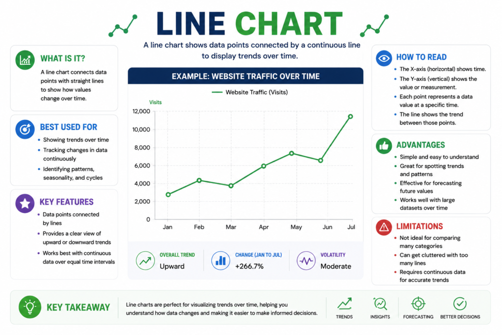
What Line Charts Show: Line charts connect closing prices over time with a single continuous line, creating the simplest visualization of price movement. The chart plots only one data point per period, typically the closing price and draws a line connecting these sequential points.
Best Uses for Line Charts
Line charts excel at providing quick, high-level overviews of price direction without unnecessary detail. They’re particularly effective for long-term trend analysis using weekly or monthly timeframes, where individual candlestick details become noise rather than signal.
For presentations and reports, line charts offer clean, professional visualizations that non-technical audiences can immediately understand. They’re also useful when comparing multiple cryptocurrencies simultaneously, as overlaying three or four line charts remains readable while multiple candlestick charts become cluttered.
Limitations of Line Charts
Line charts miss important intraday price action by ignoring opening, high, and low prices. This limitation prevents traders from spotting candlestick patterns, which provide essential reversal signals.
They also hide volatility information: a period with wild price swings and one with minimal movement appear identical if they share the same closing price.
When to Use Line Charts: Choose line charts for initial asset assessments, checking overall market sentiment, or analyzing multi-year trends where daily fluctuations don’t matter.
For example, when Bitcoin moved from $16,000 at its November 2022 bottom to $69,000 at its 2024 high, a line chart cleanly shows this 331% gain without the noise of daily $2,000-3,000 swings that can obscure the bigger picture.
Chart Type 2: Bar Charts (OHLC)
Alt text: Bar Charts
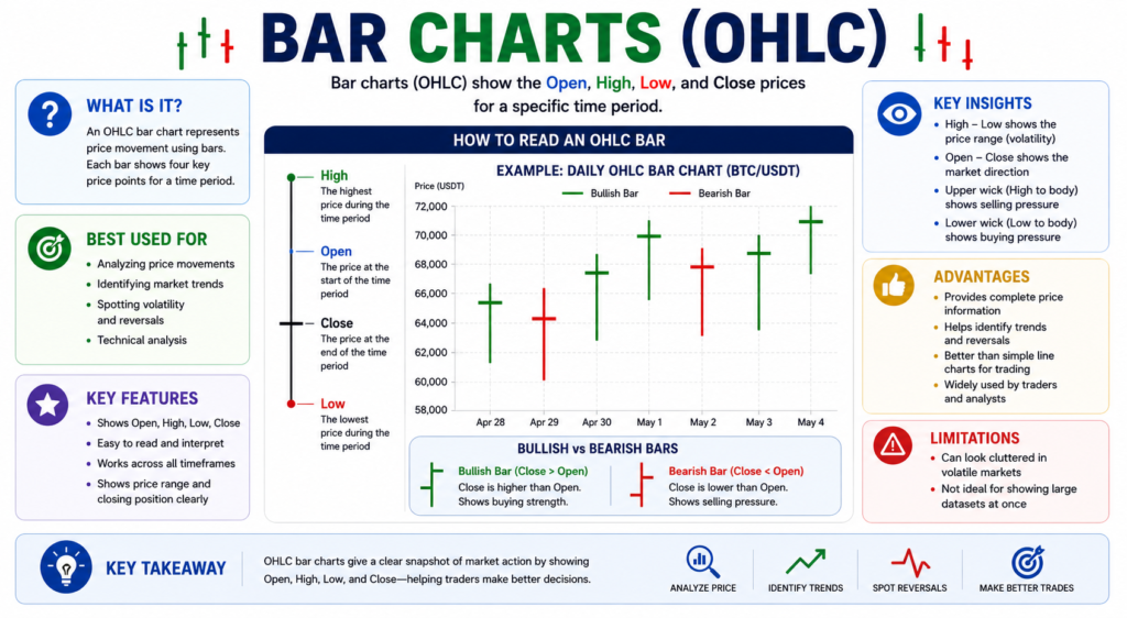
What Bar Charts Show: Bar charts display four important price points for each period through vertical bars: Open, High, Low, and Close (OHLC). This format provides significantly more information than line charts while maintaining a cleaner appearance than candlesticks.
Anatomy of a Bar Chart
The vertical line’s height represents the period’s range from lowest to highest price reached. A small horizontal tick extending left marks the opening price, while a tick extending right indicates the closing price.
Green or white bars signal bullish periods where the close exceeded the open, while red or black bars indicate bearish periods where the close fell below the open.
Best Uses for Bar Charts
Bar charts provide detailed price action analysis without the visual “clutter” some traders perceive in candlesticks. They’re popular in professional trading environments where precision matters and clean charts are preferred. The format is also common in forex and commodity markets, making it familiar to traders crossing over from those markets into crypto.
Limitations of Bar Charts
Bar charts are less visually intuitive than candlesticks for quick pattern recognition. The ticks representing opens and closes don’t create the immediate visual impact of candlestick bodies, making rapid chart scanning more difficult.
Also, bar charts aren’t as popular in the crypto community; most platforms default to candlesticks meaning fewer educational resources focus on bar chart patterns.
When to Use Bar Charts: Some professional traders prefer bar charts when they find candlesticks “too busy” or when analyzing forex and commodity correlations with crypto. Bar charts work well for traders who want detailed OHLC information but prefer a more minimalist aesthetic.
Chart Type 3: Candlestick Charts
What Candlestick Charts Show: Candlestick charts provide the most detailed visualization of price action, displaying OHLC data plus visual momentum indicators through their distinctive shape. They’ve become the standard in cryptocurrency trading due to their superior pattern recognition capabilities.
Anatomy of a Candlestick
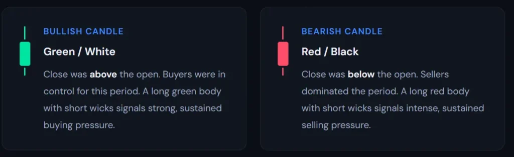
The thick rectangle called the “body” shows the range between opening and closing prices. When the closing price exceeds the opening price, the body appears green or white (bullish), indicating buying pressure dominated. When the closing price falls below the opening price, the body appears red or black (bearish), signaling selling pressure prevailed.
The thin line extending above the body called the upper wick or upper shadow represents the highest price reached during the period before sellers pushed it back down.
Similarly, the thin line extending below the body the lower wick or lower shadow shows the lowest price reached before buyers stepped in.
Why Candlesticks Dominate Crypto Trading
Candlesticks offer instant visual clarity, allowing traders to immediately distinguish bullish from bearish periods with a glance. This visual efficiency becomes crucial when monitoring multiple timeframes or assets simultaneously.
Over 50 distinct candlestick patterns provide actionable trading signals for reversals and continuations. These patterns, refined over 300 years since their invention in Japanese rice markets, offer statistically validated insights into likely future price movements.
Wick length indicates rejection strength and provides critical information about market sentiment. A long lower wick shows that sellers pushed price down aggressively, but buyers overwhelmed them and drove price back up a bullish signal.
Contrarily, a long upper wick reveals that buyers attempted a rally but sellers forcefully rejected higher prices, a bearish indication.
Reading Individual Candles
A long body with short wicks signals strong directional conviction. When bulls or bears dominate completely, they don’t allow the opposing side to push price far from the open-close range, creating minimal wicks and a prominent body.
A small body with long wicks indicates indecision and high volatility. Both sides fought intensely, pushing price to extremes, but neither established control by the closing bell.
No lower wick on a green candle demonstrates strong buying pressure throughout the entire period. Buyers started at the low and maintained control, never allowing price to dip below the opening level, an extremely bullish signal.
No upper wick on a red candle shows relentless selling pressure all period long. Sellers opened at the high and maintained control, never permitting a meaningful bounce, a very bearish indicator.
Best Uses for Candlesticks: Over 90% of crypto traders use candlestick charts because they excel at pattern recognition, provide quick sentiment assessment, and work effectively across all timeframes from one-minute scalping to monthly position trading.
Real Example: On October 15, 2025, Bitcoin formed a “hammer” candlestick on the daily chart after dropping to $66,000. The candle showed a long lower wick extending to $64,200 before closing at $67,500.
This formation signaled that buyers stepped in strongly at lower levels, rejecting further downside. The hammer led to a rally to $72,000 over the next five days, validating the bullish signal.
Chart Type Comparison
| Feature | Line Chart | Bar Chart | Candlestick Chart |
| Visual Clarity | High | Medium | Highest |
| Information Density | Low | High | Highest |
| Pattern Recognition | Poor | Good | Excellent |
| Best Timeframe | Weekly-Monthly | Daily-Weekly | All timeframes |
| Beginner-Friendly | Yes | Moderate | Yes (with learning) |
| Professional Use | Presentations | Forex/commodities | Crypto standard |
| Mobile Viewing | Excellent | Good | Good |
Support and Resistance: The Foundation of Price Action
Support and resistance represent the most fundamental concepts in technical analysis, forming the foundation upon which all other chart reading skills are built. Understanding these important price levels changes random price movements into predictable patterns and actionable trading opportunities.
What Are Support and Resistance?
Support and resistance are specific price levels where buying or selling pressure becomes concentrated enough to halt or reverse price movements. Think of them as invisible floors and ceilings that price repeatedly bounces off or struggles to break through.
Support represents a price level where buying pressure exceeds selling pressure, preventing further declines. When price approaches support, buyers perceive value and step in aggressively, creating a “floor” that catches falling prices.
Each time price tests support and bounces, that level gains credibility and psychological significance among market participants.
Resistance represents a price level where selling pressure exceeds buying pressure, preventing further advances.
As price approaches resistance, sellers become more aggressive either taking profits from earlier purchases or initiating short positions creating a “ceiling” that caps rallies. Repeated tests of resistance without breakthrough reinforce its importance.
The fundamental principle underlying support and resistance is that price has memory. Traders remember where they bought, sold, made profits, or suffered losses. These psychological anchors create concentrated zones of buying and selling activity at specific price levels.
How Support and Resistance Form
Support and resistance levels emerge through several distinct mechanisms, each carrying different weight and reliability.
1. Previous Peaks and Troughs: The most obvious support and resistance levels come from previous significant highs and lows. When Bitcoin reaches $70,000 and reverses sharply, that peak becomes resistance.
If price later rallies back toward $70,000, traders remember the previous rejection and many will sell in anticipation, reinforcing the resistance. Similarly, significant lows where price bounced strongly become support levels.
2. Round Numbers and Psychological Levels: Human psychology gravitates toward round numbers. Levels like $50,000, $60,000, or $100,000 for Bitcoin naturally attract attention and trading activity.
Traders set limit orders, stop-losses, and profit targets at these psychologically significant levels, creating concentrations of orders that manifest as support or resistance.
3. Moving Averages as Dynamic Support/Resistance: Unlike static horizontal levels, moving averages provide dynamic support and resistance that moves with price.
The 200-day moving average, in particular, serves as a critical long-term support level in uptrends and resistance in downtrends. Price often gravitates back toward major moving averages after deviating significantly.
4. Previous Breakout Points: Once resistance breaks and price closes decisively above it, that former resistance often transforms into new support a phenomenon called “role reversal” or “support-resistance flip.”
This occurs because traders who missed the initial breakout wait for pullbacks to that level for second-chance entries, while those who bought the breakout defend that level to validate their trade.
5. Volume-Based Levels: High-volume nodes from Volume Profile analysis represent price levels where substantial trading occurred, indicating strong participant interest.
These levels frequently act as support or resistance because many traders established positions there and will defend those levels.
6. Fibonacci Retracement Levels: While technically a derived calculation rather than pure price action, Fibonacci levels (particularly 38.2%, 50%, and 61.8% retracements) often function as support or resistance because thousands of traders watch and trade these levels, creating self-fulfilling prophecies.
The Strength of Support and Resistance
Not all support and resistance levels carry equal weight. Several factors determine a level’s significance and likelihood of holding when tested.
1. Number of Tests: The more times price tests a level without breaking through, the stronger that level becomes. A support level tested five times and holding each time carries far more weight than one tested only once.
However, repeated tests also weaken levels over time as sellers gradually overwhelm buyers (at support) or buyers exhaust sellers (at resistance).
2. Timeframe Significance: Support and resistance levels visible on higher timeframes (weekly, monthly) prove far more significant than those appearing only on lower timeframes (15-minute, 1-hour). A weekly support level will typically override any conflicting 1-hour resistance levels.
3. Volume at Formation: Levels formed with high volume carry more weight than those established on light volume.
High volume indicates strong conviction and emotional commitment from numerous participants, making those levels more likely to hold on subsequent tests.
4. Time at Level: Price spending extended periods at a specific level increases its significance. If Bitcoin consolidates between $68,000 and $70,000 for three weeks, both boundaries become strong support and resistance respectively due to the volume and participant positioning that occurred during that consolidation.
5. Recency: More recent support and resistance levels typically carry more weight than ancient levels, though major historical highs and lows retain significance for years. The 2021 Bitcoin all-time high around $69,000 remained relevant resistance throughout 2024-2025.
Support and Resistance Zones
An important concept often overlooked by beginners is that support and resistance rarely exist at precise price points but rather as zones or ranges spanning several percentage points.
Rather than expecting Bitcoin to respect support exactly at $65,000, professional traders identify support zones perhaps between $64,500 and $65,500.
This zone approach accounts for several realities: different exchanges showing slightly different prices, psychological clustering around round numbers, and the fact that participants place orders across a range rather than at one specific price.
Trading Zones Rather Than Lines: Instead of placing buy orders at an exact support level like $65,000, experienced traders begin scaling into positions across the support zone, perhaps buying 25% at $65,400, another 25% at $65,100, another 25% at $64,800, and the final 25% at $64,500.
This approach improves average entry prices and reduces risk of missing trades due to price wicking just above or below your target.
Zone Width Guidelines: For Bitcoin, support and resistance zones typically span $500-1,500 depending on the price level and timeframe.
For smaller-cap altcoins with higher volatility, zones might span 3-5% of the current price. The higher the timeframe, the wider the acceptable zone.
Support and Resistance Role Reversal
One of the most powerful concepts in technical analysis is that support and resistance levels frequently reverse roles after being broken.
Support Becoming Resistance: When a support level breaks decisively to the downside, that former support often becomes new resistance.
This occurs because traders who bought at that support level and held through the breakdown view rallies back to their entry as opportunities to exit at breakeven, creating concentrated selling pressure.
Also, traders who shorted the breakdown defend their positions by adding to shorts at that former support.
Resistance Becoming Support: When price breaks above resistance and closes significantly higher, that former resistance typically transforms into new support.
Traders who missed the initial breakout wait for pullbacks to that level for second-chance entries. Those who bought the breakout view it as a critical level to defend, often adding to positions if price returns.
Trading the Flip: The support-resistance flip provides high-probability trading opportunities. After a breakout above resistance, wait for price to pull back and test that former resistance as new support.
Entry comes when price bounces from that level with confirmation (bullish candlestick pattern, volume surge, or indicator signal).
Stop-loss sits just below the support level being tested. This setup offers excellent risk-reward ratios because the stop-loss can be tight while targets extend to the next resistance level.
Identifying Strong Support and Resistance Levels
Developing the skill to identify the most significant support and resistance levels separates profitable traders from those who struggle. Follow this systematic approach:
Start with Higher Timeframes: Begin your analysis on weekly and daily charts to identify major support and resistance levels. Mark obvious peaks and troughs where price reversed sharply.
Look for round numbers where price has historically reacted. Note where the 50-day, 100-day, and 200-day moving averages currently sit.
Add Historical Levels: Examine price history going back months or even years to find significant levels. The 2021 Bitcoin all-time high around $69,000 remained relevant throughout 2024-2025 as both resistance on the way up and potential support if broken.
Previous halving cycle highs and lows often retain significance across entire market cycles.
Mark Consolidation Zones: Areas where price traded sideways for extended periods create strong support and resistance zones.
These consolidations represent equilibrium points where substantial volume occurred, meaning many traders established positions that they’ll defend.
Use Horizontal Line Tools: Most charting platforms offer horizontal line drawing tools. Draw lines at obvious support and resistance levels, using different colors to distinguish between them (green for support, red for resistance is common). Adjust these lines as new levels emerge or old levels break.
Connect Multiple Touches: The strongest levels are those tested multiple times. If you notice price respecting a level on three, four, or five separate occasions, that level deserves special attention and bold marking on your chart.
Watch for Confluence: The most powerful support and resistance levels occur where multiple factors align.
For example, a previous major low that coincides with the 200-day moving average and a round number like $60,000 creates a confluence zone with high probability of holding.
Trading Support and Resistance
Support and resistance levels provide the foundation for virtually all trading strategies. Here’s how to trade them effectively:
1. Buying Support: The classic strategy involves buying when price approaches support levels. However, never buy simply because price has reached support wait for confirmation.
Look for bullish candlestick patterns (hammer, bullish engulfing, morning star) forming at the support level. Watch for volume spikes indicating buying pressure. Observe indicators like RSI reaching oversold conditions then turning up.
Place stop-losses just below the support level, typically 2-3% beneath it to avoid premature stop-outs from wicks. Target the midpoint between support and resistance or the resistance level itself.
2. Selling Resistance: The opposite strategy involves selling or taking profits when price approaches resistance.
Again, wait for confirmation through bearish candlestick patterns (shooting star, bearish engulfing, evening star), volume expansion on the rejection, or indicators showing overbought conditions reversing.
Stop-losses sit just above resistance. Targets include the midpoint between levels or the support level below.
3. Breakout Trading: Instead of trading bounces off support and resistance, breakout traders wait for these levels to break decisively. Enter long positions when price closes significantly above resistance (2-3% minimum) on expanding volume. Enter short positions when price closes below support on high volume.
Place stops on the opposite side of the broken level above resistance for shorts, below support for longs. Target the next significant support or resistance level, often measuring a distance equal to the previous range.
4. Fakeout Awareness: False breakouts or “fakeouts” occur frequently and trap novice traders. Price briefly breaks through support or resistance, triggering breakout trades and stop-losses, before quickly reversing back within the previous range.
Avoid fakeouts by requiring confirmation wait for candle closes beyond levels rather than wicks, demand volume expansion, and consider waiting for a successful retest of the broken level before entering.
Common Support and Resistance Mistakes
Mistake 1: Drawing Too Many Lines: Marking every minor swing high and low clutters charts and creates analysis paralysis. Focus on the most obvious, significant levels that jump out immediately. If you need to squint to see whether a level is significant, it probably isn’t.
Mistake 2: Expecting Exact Precision: Beginners often expect price to respect support or resistance at exact prices to the dollar.
Remember that these are zones, not laser-precise levels. Allow for some variance and use zones rather than exact lines.
Mistake 3: Ignoring Context: A support level that held multiple times in a bull market might fail immediately in a bear market. Always consider the broader trend context.
Support levels hold much more reliably in uptrends, while resistance levels prove more significant in downtrends.
Mistake 4: Fighting Broken Levels: Once support breaks convincingly, don’t continue buying in hopes it will hold. Accept that the level has broken and adjust your analysis accordingly. The same applies to broken resistanc once it fails, stop shorting against the breakout.
Mistake 5: Neglecting Higher Timeframes: A support level on a 15-minute chart means little if price is falling toward major daily or weekly support far below. Always check higher timeframe support and resistance before trading lower timeframe levels.
Understanding Timeframes: The Multi-Dimensional Approach
One of the most critical yet often overlooked aspects of chart reading is timeframe selection. The same cryptocurrency can appear to be in a strong uptrend on one timeframe while simultaneously showing a downtrend on another.
Mastering multiple timeframe analysis separates consistently profitable traders from those who struggle.
The Timeframe Spectrum
Cryptocurrency charts can display data across virtually infinite timeframes, but traders typically focus on key periods that align with their trading style.
Ultra-Short Timeframes (Scalping): One-minute and five-minute charts serve scalpers who execute dozens of trades daily, capturing small price movements repeatedly. These timeframes show extreme noise, including the impact of wash trading and market maker manipulation.
Trading at this speed requires lightning-fast reflexes, low-latency execution, and high stress tolerance. Futures traders often use these timeframes during particularly volatile events like major economic announcements or exchange listings.
Short Timeframes (Day Trading): Fifteen-minute, thirty-minute, and one-hour charts capture intraday swings and momentum shifts. These timeframes effectively track news reactions, technical breakouts, and trading session patterns.
Day traders and algorithmic trading bots predominantly operate on these timeframes, requiring active monitoring and quick decision-making throughout the trading session.
Medium Timeframes (Swing Trading): Four-hour and daily charts represent the sweet spot for most retail crypto traders. These timeframes filter out noise while capturing meaningful trends, producing the most reliable signals.
Swing traders hold positions from several days to several weeks, requiring patience, strong pattern recognition skills, and disciplined risk management.
Statistics suggest approximately 80% of consistently profitable retail crypto traders operate primarily on these medium timeframes.
Long Timeframes (Position Trading): Weekly and monthly charts reveal macro trends including bull-bear cycles, halving patterns, and long-term adoption curves. Position traders hold for months or even years, requiring strong conviction and integration of fundamental analysis with technical charts.
These timeframes work best for long-term investors executing accumulation strategies during bear markets and distribution during bull market peaks.
Multiple Timeframe Analysis (MTA) – The Critical Skill
Professional traders never trade from a single timeframe. The fundamental rule states: Check at least three timeframes before entering any trade. This approach dramatically improves win rates by ensuring trades align with multiple levels of market structure.
The Top-Down Approach
Step 1 – Start with Higher Timeframes (Weekly/Daily): Begin by identifying the overall trend on weekly or daily charts. Determine whether Bitcoin or your target cryptocurrency is in a macro uptrend or downtrend.
Locate major support and resistance levels that have held on multiple occasions. Observe the 200-day moving average’s behavior is price above or below this critical long-term trend indicator?
Step 2 – Move to Medium Timeframes (4-Hour/1-Hour): Once you understand the macro trend, examine medium timeframes to find structure within that trend. Determine if current price action represents a pullback within an uptrend or a potential breakout from consolidation.
Identify whether price is testing key support or resistance levels from this timeframe perspective. Look for patterns forming that might provide trading opportunities aligned with the higher timeframe trend.
Step 3 – Zoom to Entry Timeframe (15-Minute/1-Hour): Finally, use lower timeframes to time your specific entry with precision. Wait for confirmation signals such as candle closes above resistance or indicator crossovers.
Set precise stop-loss levels based on this timeframe’s recent swing points. Determine your exact entry price that offers optimal risk-reward ratios.
Real Trading Example – Bitcoin October 2025
Let’s examine how a professional trader might have analyzed Bitcoin using multiple timeframe analysis in October 2025:
Weekly Chart Analysis: The weekly chart showed a clear uptrend since July 2025, with price consistently respecting the 20-week moving average as support during pullbacks. The overall structure pointed toward a target of $85,000 based on the uptrend’s angle and previous resistance levels.
Daily Chart Analysis: Zooming into the daily chart revealed that price had pulled back to $67,000, which represented previous resistance from September that had now flipped to support a bullish indication. An ascending triangle pattern was forming with higher lows testing the $67,000 level repeatedly.
4-Hour Chart Analysis: The four-hour chart showed price bouncing off $67,000 support three distinct times, with the Relative Strength Index dropping to oversold levels around 28. Volume had declined during the pullback, suggesting seller exhaustion rather than aggressive distribution.
1-Hour Chart Analysis: Finally, the one-hour chart displayed a bullish engulfing candlestick pattern at the $67,000 support zone. The MACD indicator crossed into positive territory, and a volume spike accompanied the reversal candle—strong confirmation signals for an entry.
The Trade Decision: Enter a long position at $67,800 with a stop-loss at $66,500 (just below the three-touch support level) and a target of $72,000 based on the ascending triangle’s height projection. The risk of $1,300 per position offered a reward potential of $4,200, providing better than 3:1 risk-reward.
The Result: The trade was stopped out at $66,500 for a 2% loss when price briefly dipped below support before eventually rallying. While this specific trade lost money, the setup methodology was valid risk management protected capital, and the trader could take the next setup with confidence knowing their process was sound.
Common Multiple Timeframe Analysis Mistakes
Trading Against Higher Timeframe Trends: One of the most common and costly mistakes involves taking positions that contradict the higher timeframe trend.
For example, shorting Bitcoin on a 15-minute bearish pattern while the daily chart shows a strong uptrend dramatically reduces your probability of success. The higher timeframe trend tends to reassert itself, stopping out counter-trend trades.
Ignoring Higher Timeframe Resistance: Traders sometimes buy breakouts on lower timeframes without checking if that breakout immediately hits significant daily or weekly resistance.
Even if the entry signal appears perfect on the one-hour chart, hitting daily resistance often caps the move’s potential.
Over-Focusing on Short Timeframes: Excessive focus on very short timeframes amplifies noise and leads to overtrading. Every minor price fluctuation seems significant on a five-minute chart, triggering emotional responses and impulsive decisions that wouldn’t occur if viewing higher timeframes.
The 3-Timeframe Rule
Structure your analysis using three specific timeframes:
Primary Timeframe: The timeframe where you identify the trade opportunity and watch for your entry signal. This should match your trading style one-hour for day traders, four-hour or daily for swing traders.
Higher Timeframe (4-6x Primary): Confirms the trend direction and provides important context. If your primary timeframe is one-hour, check the four-hour or daily chart to ensure you’re trading with the prevailing trend.
Lower Timeframe (1/3-1/4 Primary): Times precise entry and exit points. If your primary timeframe is four-hour, drop to one-hour or 15-minute charts to identify exact entry levels and initial stop-loss placement.
Timeframe Selection by Trading Style
Scalper (Position Duration: Seconds to Minutes):
- Primary charts: 1-minute to 5-minute
- Higher timeframe: 15-minute for trend context
- Lower timeframe: Tick charts for precise timing
- Trades per day: 20-100+
- Pros: Numerous opportunities, small stop-losses, potentially high returns
- Cons: Extreme stress, transaction fees accumulate quickly, requires full-time attention
Day Trader (Position Duration: Minutes to Hours):
- Primary charts: 15-minute to 1-hour
- Higher timeframe: 4-hour for trend direction
- Lower timeframe: 5-minute for entry precision
- Trades per day: 3-10
- Pros: Captures intraday volatility, no overnight risk exposure
- Cons: Requires active monitoring throughout trading sessions
Swing Trader (Position Duration: Days to Weeks):
- Primary charts: 4-hour to daily
- Higher timeframe: Weekly for macro trend
- Lower timeframe: 1-hour for entries
- Trades per month: 5-15
- Pros: Best win rates, less stressful, compatible with day jobs
- Cons: Overnight gap risk, requires patience during consolidation
Position Trader (Position Duration: Weeks to Months):
- Primary charts: Daily to weekly
- Higher timeframe: Monthly for macro perspective
- Lower timeframe: 4-hour for entry refinement
- Trades per year: 10-30
- Pros: Lowest stress, captures major trends, integrates well with fundamentals
- Cons: Requires significant capital, emotional fortitude during drawdowns
Recommendation for Beginners: Start with daily and 4-hour charts for swing trading. These timeframes filter out noise while displaying clear patterns, allow learning without requiring 24/7 monitoring, produce the most statistically reliable signals, and provide time to think analytically rather than react emotionally.
Candlestick Patterns: The Language of Charts
Candlestick patterns form the foundation of technical chart reading, providing visual representations of market psychology at critical inflection points. Understanding these patterns transforms raw price data into actionable trading insights.
Understanding Candlestick Psychology
Every candlestick tells a story about the ongoing battle between bulls (buyers) and bears (sellers). A long green body demonstrates that bulls dominated the entire period, pushing price steadily higher.
Long wicks reveal that one side attempted to control price but ultimately failed, with the opposing side rejecting their efforts.
The Four Price Points and Their Significance
The opening price reflects initial market sentiment at the period’s start. The closing price carries the most weight for trend determination, as it represents the final consensus reached after all buying and selling pressure played out.
The high marks maximum bull strength the furthest point bulls managed to push price before encountering resistance. The low indicates maximum bear strength the deepest level bears drove price before meeting support.
Why Patterns Work: Candlestick patterns have over 300 years of statistical backing since their development in 18th-century Japanese rice markets. Thomas Bulkowski’s comprehensive “Encyclopedia of Candlestick Charts” analyzed thousands of pattern instances, finding many achieve 60-85% success rates when confirmed with volume.
These patterns work because human psychology fear, greed, hope, and panic remains remarkably consistent across centuries and markets.
Single Candlestick Patterns
1. Doji (Indecision Signal)
The doji appears when opening and closing prices are virtually identical, creating a small or non-existent body with varying wick lengths. This formation signals that bulls and bears fought to a stalemate, with neither side winning decisively.
The doji’s meaning depends on context. At trend extremes, dojis suggest potential reversals as the previous trend loses momentum. In ranging markets, they simply confirm the ongoing indecision.
Doji Variants: The dragonfly doji features a long lower wick with no upper wick, indicating potential bullish reversal after sellers pushed price down but buyers aggressively rejected lower levels.
The gravestone doji displays a long upper wick with no lower wick, suggesting potential bearish reversal after buyers drove price up but sellers forcefully pushed it back down. The long-legged doji shows extended wicks in both directions, revealing extreme volatility and uncertainty.
Success rates hover around 60-65% when dojis appear at trend extremes, according to Bulkowski’s research.
2025 Example: Ethereum formed a dragonfly doji on September 28, 2025, at $2,400 support after a 15% decline. The long lower wick to $2,320 showed strong buyer interest at that level. Price subsequently rallied 12% over the next eight days to $2,688, confirming the bullish reversal signal.
2. Hammer & Hanging Man (Reversal Indicators)
These patterns share identical appearances small bodies near the top of the range with long lower wicks (2-3 times body length) and minimal upper wicks. Context determines whether they signal bullish or bearish reversals.
The hammer appears in downtrends at support levels. Price dropped sharply, but bulls pushed back forcefully before the close, creating the long lower wick. This formation suggests selling pressure is exhausting. Confirmation requires the next candle to close above the hammer’s high.
The hanging man has the same shape but appears in uptrends at resistance. Despite the initial appearance, the long lower wick in an uptrend suggests bulls are losing control as bears managed to push price significantly lower during the period before a modest recovery.
Success rates reach 60-66% for hammers and 59% for hanging men in Bulkowski’s data.
Trading Strategy: Always wait for confirmation. For hammers, enter when the next candle closes above the hammer’s high, place stop-loss below the hammer’s low, and target twice the risk distance. For hanging men, consider shorts when the next candle closes below the hanging man’s low.
3. Inverted Hammer & Shooting Star
These patterns feature small bodies near the bottom of the range with long upper wicks and minimal lower wicks essentially upside-down versions of hammers.
The inverted hammer appears in downtrends. Bulls attempted to push price up (creating the long upper wick) but failed initially. However, the closing price near the opening suggests underlying buying interest. This pattern requires strong confirmation as many fail without follow-through.
The shooting star forms in uptrends and proves highly reliable. Bulls pushed price to new highs (upper wick) but bears completely rejected those levels, forcing price back near the opening. High volume on the shooting star strengthens the bearish signal.
Success rates measure 63% for inverted hammers and 67% for shooting stars according to Bulkowski.
4. Marubozu (Strong Momentum)
Marubozu candles display long bodies with little to no wicks on either end, indicating one side maintained complete control throughout the entire period.
Bullish marubozu candles are green, opening at the low and closing at or near the high. Bulls dominated from start to finish without allowing any meaningful pullback. These often start strong trends or provide powerful continuation signals within existing uptrends.
Bearish marubozu candles are red, opening at the high and closing at or near the low. Bears controlled price relentlessly, never permitting a significant bounce. These frequently signal the start of strong downtrends.
Trading strategy focuses on trend continuation rather than reversals. Enter in the direction of the marubozu with stops beyond the opposite end of the candle.
Success rates range 55-60%, but the directional signals prove highly reliable.
5. Spinning Top
Spinning tops have small bodies centered in the middle of the range with wicks of roughly equal length extending both directions. This formation indicates high volatility coupled with no decisive winner.
After strong trends, spinning tops signal potential exhaustion. In ranging markets, they simply confirm the ongoing indecision. Standalone success rates measure 52-55%, but they provide valuable context when combined with other indicators or pattern formations.
Multiple Candlestick Patterns
1. Bullish Engulfing (Strong Reversal Signal)
This powerful two-candle pattern begins with a small red candle followed by a large green candle whose body completely engulfs the previous candle’s body. Wicks don’t need to be engulfed, only the body matters.
The pattern must occur in a downtrend to be valid. The first candle shows bears maintaining control, but the second candle demonstrates bulls overwhelming them completely, often signaling a trend shift.
Volume confirmation is important; the engulfing candle should show at least twice the average volume to validate the reversal.
Success rates reach 70-76% with proper volume confirmation, making this one of Bulkowski’s best-performing reversal patterns.
Trading Strategy: Enter on the close of the engulfing candle or on a slight pullback the following day. Place stop-loss below the engulfing candle’s low. Target previous resistance levels or use a 1:2 minimum risk-reward ratio.
2. Bearish Engulfing (Strong Reversal Signal)
The mirror opposite of bullish engulfing, this pattern shows a small green candle followed by a large red candle that completely engulfs it. The pattern must appear in an uptrend.
Bulls briefly maintained control on day one, but bears completely overwhelmed them on day two, often marking important tops.
Success rates measure 72-78%, slightly more reliable than bullish engulfing patterns.
3. Piercing Pattern (Bullish Reversal)
This two-candle pattern begins with a long red candle followed by a green candle that opens below the previous close but closes above the midpoint of the red candle’s body.
Requirements include appearance in a downtrend and the green candle closing above the 50% mark of the red candle (stronger if it closes above 62-78%, the Fibonacci levels).
Bears pushed lower initially (gap down open), but bulls rallied strongly, reclaiming over half the prior day’s losses a show of strength suggesting potential reversal.
Success rates range 65-69%, somewhat less reliable than bullish engulfing, thus requiring more confirmation.
4. Dark Cloud Cover (Bearish Reversal)
The opposite of the piercing pattern, dark cloud cover shows a long green candle followed by a red candle that opens above the previous close but closes below the midpoint of the green candle’s body.
The pattern must appear in uptrends. Bulls gapped up optimistically, but bears took control and erased most of those gains, suggesting the uptrend is weakening.
Success rates measure 67-71%.
5. Morning Star (Highly Reliable Bullish Reversal)
This three-candle pattern provides one of the most reliable reversal signals in technical analysis.
Day one shows a long red candle as the downtrend continues. Day two displays a small-bodied candle (doji or spinning top) that gaps down from the first candle, signalling indecision; this is the critical inflection point where sentiment begins shifting.
Day three presents a long green candle closing above the midpoint of the first day’s red candle, confirming bulls have seized control.
The pattern must form in a downtrend, with the middle candle ideally gapping away from both surrounding candles (though in 24/7 crypto markets, gaps aren’t required). The third candle should show volume expansion to confirm the reversal.
Success rates reach 78-83%, making this one of Bulkowski’s highest-performing patterns.
Trading Strategy: Enter on the close of the third candle, place stop-loss below the pattern’s lowest point, and target previous resistance or use measured move calculations.
2025 Example: Bitcoin formed a textbook morning star at $64,000-65,000 support from September 6-8, 2025. The first candle dropped to $64,200, a doji formed at $64,500 showing indecision, and the third candle rallied to $66,800 confirming the reversal. Bitcoin continued to $72,100 over the next 14 days, gaining 12%.
6. Evening Star (Highly Reliable Bearish Reversal)
The mirror of the morning star, this three-candle pattern signals trend exhaustion at market tops.
Day one shows a long green candle continuing the uptrend. Day two displays a small-bodied candle gapping up from the first, revealing indecision at the top.
Day three presents a long red candle closing below the midpoint of the first green candle, confirming bears have taken control.
Success rates measure 78-81%.
2025 Example: Ethereum formed an evening star at $3,850 resistance from July 22-24, 2025. The pattern led to a decline to $3,420, an 11% drop over nine days.
7. Three White Soldiers (Strong Bullish Continuation)
Three consecutive long green candles, each opening within the previous candle’s body and closing progressively higher, form this powerful pattern. All three candles should be similar in size with minimal upper wicks, showing consistent buying pressure.
This pattern signals three days of sustained, disciplined buying typically institutional accumulation.
Success rates reach 81-85% for trend continuation.
Caution: After extended rallies, three white soldiers can signal exhaustion rather than continuation, as excessive optimism often precedes corrections.
8. Three Black Crows (Strong Bearish Continuation)
The opposite of three white soldiers, this pattern shows three consecutive long red candles, each opening within the previous candle’s body and closing progressively lower.
Three days of unrelenting selling pressure suggests strong bearish conviction, often from institutional distribution.
Success rates measure 82-86%.
Chart Patterns: The Roadmap to Price Movement
While individual candlesticks reveal short-term sentiment, chart patterns formed by multiple candlesticks over days or weeks provide the roadmap for larger price movements. These patterns visualize mass psychology at major inflection points, creating actionable trading opportunities.
Pattern Psychology Foundation
Chart patterns work because they make visible the collective psychology of thousands or millions of market participants. When numerous traders recognize the same pattern such as a head-and-shoulders neckline break heir similar actions create self-fulfilling prophecies. Mass buying or selling at these recognized levels reinforces the pattern’s validity.
Pattern Classifications
- Reversal Patterns signal trend exhaustion and potential direction changes, typically forming at major tops or bottoms after extended moves.
- Continuation Patterns represent brief pauses or consolidations within existing trends before resumption of the prevailing direction.
- Bilateral Patterns can break in either direction depending on momentum and market conditions, requiring traders to wait for confirmed breakouts.
Critical Pattern Components
- Volume Confirmation proves essential for pattern validity. Breakouts occurring on low volume frequently fail, producing “fakeouts” that trap early entries. Genuine breakouts show volume expansion of 1.5-2x average levels.
- Timeframe Matters significantly the same pattern appearing on a daily chart carries far more weight than an identical formation on a one-hour chart.
- Measured Moves provide price targets calculated from pattern dimensions, giving traders specific profit objectives.
- Stop-Loss Placement should utilize natural invalidation points within each pattern structure to define and limit risk.
Reversal Patterns
1. Head and Shoulders (Bearish Reversal)
The head and shoulders pattern ranks among the most reliable bearish reversal formations, appearing after extended uptrends.
The pattern consists of three distinct peaks: a left shoulder, a higher central peak (the head), and a right shoulder at approximately the same height as the left.
Pattern Components
The left shoulder forms when price rallies to a new high then pulls back, typically on declining volume. The head develops as price rallies even higher than the left shoulder before pulling back again, often with volume lower than the left shoulder rally.
The right shoulder emerges when price makes one final rally attempt, reaching a level similar to the left shoulder (sometimes slightly higher or lower) before breaking down. The neckline connects the two pullback lows, acting as critical support.
Pattern Completion: The pattern completes when price closes decisively below the neckline, typically accompanied by expanding volume.
Measured Move Target: Calculate the target by subtracting the vertical distance from the head’s high to the neckline from the neckline breakdown point: Target = Neckline − (Head High − Neckline).
Volume Pattern Significance: The left shoulder typically shows high volume. The head displays lower volume despite making new highs; this divergence serves as an early warning sign.
The right shoulder exhibits even lower volume, confirming weakening bullish momentum. The breakdown below the neckline should show a volume spike for confirmation.
Success rates reach 84-87% for meeting targets according to Bulkowski’s research, making this extremely reliable.
Stop-Loss Strategy: Place protective stops slightly above the right shoulder’s high to limit risk if the pattern fails.
2025 Example: Cardano (ADA) formed a head-and-shoulders pattern from July through September 2025. The left shoulder reached $0.52 on July 8, the head topped at $0.585 on August 2, and the right shoulder formed at $0.51 on September 5.
The neckline sat at $0.44. When price broke down on September 18, the measured target of $0.36 was reached, with price ultimately hitting a low of $0.365 on October 2.
2. Inverse Head and Shoulders (Bullish Reversal)
This upside-down version of the head and shoulders appears after downtrends, signaling potential bullish reversals. The pattern shows three valleys with the central valley (head) deeper than the two shoulders.
Bears progressively lose momentum as they fail to drive price to new lows, while bulls gradually accumulate, eventually breaking above the neckline to trigger the reversal.
Success rates measure 80-84%.
2025 Example: Bitcoin formed an inverse head-and-shoulders pattern in the $58,000-$67,000 range during late August 2025. The neckline at $67,000 broke on October 1, projecting a target of $76,000. As of mid-October, Bitcoin has reached $72,000 with the pattern still developing.
3. Double Top (Bearish Reversal)
The double top pattern shows two peaks at similar price levels separated by a valley, signaling that bulls have exhausted their strength at that resistance level.
Pattern Components: The first peak forms as price rallies to resistance, often on high volume. A pullback of 10-20% follows, creating the valley. The second peak develops as price rallies back to approximately the same resistance level (within 3-4% of the first peak), typically on lower volume. Breakdown occurs when price closes below the valley low (neckline).
Psychology: Bulls attempted twice to break through resistance but failed both times. This double rejection often triggers a shift in sentiment as bulls give up and bears gain confidence.
Measured Move: Target = Valley Low − (Peak High − Valley Low).
Volume Pattern: The first peak typically shows high volume while the second peak displays noticeably lower volume this divergence serves as a warning that bullish momentum is fading. The breakdown should show expanding volume to confirm the reversal.
Time Between Peaks: Ideally, peaks occur 3-8 weeks apart on daily charts. Peaks too close together may not represent a genuine double test of resistance.
Success rates range 65-72%, lower than head-and-shoulders patterns.
False Signal Risk: Double tops sometimes evolve into triple tops or eventually break through resistance, so confirmation is essential.
2025 Example: Dogecoin formed a double top at $0.085 on July 25 and August 15, 2025, with the valley at $0.072. When price broke down on August 22, the measured target of $0.059 was nearly achieved, with price reaching $0.061 on September 2.
4. Double Bottom (Bullish Reversal)
The mirror pattern of the double top, double bottoms show two valleys at similar price levels, indicating that sellers have exhausted their ability to push price lower.
Success rates measure 72-78%, proving more reliable than double tops.
Psychology: Bears tried twice to break support but failed. This double rejection demonstrates buying interest at that level, often triggering a sentiment shift as shorts begin covering and longs establish positions.
2025 Example: Ethereum formed a double bottom at $2,400 on September 12 and September 28, 2025. The peak (neckline) sat at $2,650. When price broke above on October 5, the measured target of $2,900 was established. As of mid-October, Ethereum has reached $2,750 and continues advancing.
5. Cup and Handle (Bullish Continuation/Reversal)
The cup and handle pattern stands as one of the most reliable bullish formations, showing a distinctive U-shaped “cup” followed by a slight downward drift forming the “handle.”
Pattern Components: The cup displays a rounded bottom over an extended period (ideally 3-6 months), showing gradual decline and recovery as weak hands sell to strong hands.
The handle forms as a small pullback of 10-15% after the cup completes, typically lasting 1-4 weeks. The breakout occurs when price closes above the cup rim and handle resistance on expanding volume.
Psychology: The asset found its bottom during cup formation as value buyers accumulated. The handle represents a final shakeout of weak holders before the next major leg higher.
Measured Move: Target = Cup Rim + Cup Depth.
Volume Pattern: Volume should decline progressively during cup formation, then pick up notably on the breakout above the handle.
Success rates reach 83-89%, making this one of the most reliable bullish patterns when it appears.
Stop-Loss: Place stops just below the handle’s low.
Note: This pattern appears less frequently than others but proves extremely powerful when it does form.
2025 Example: Bitcoin formed a cup-and-handle pattern from March through August 2025. The cup ranged from $60,000 down to $60,000 and back to $74,000. The handle formed from $74,000 down to $68,000.
When price broke out on August 25, the measured target of $88,000 was established. Bitcoin currently trades at $72,000 with the pattern still developing.
6. Wedges (Rising & Falling)
Wedge patterns show price making higher highs and higher lows (rising wedge) or lower lows and lower highs (falling wedge), but with the trendlines converging rather than remaining parallel like channels.
Rising Wedge (Usually Bearish): Price makes higher highs and higher lows but the range contracts as the upward slope flattens. Bulls are losing momentum despite making new highs each rally becomes less vigorous. Breakdown typically occurs downward through the lower trendline. Success rates measure 69-74%.
Falling Wedge (Usually Bullish): Price makes lower lows and lower highs but the range contracts as the downward slope flattens. Bears are losing momentum despite making new lows. Breakout typically occurs upward through the upper trendline. Success rates reach 74-81%.
Measured Move: Calculate targets using the wedge’s height at its widest point.
2025 Example: Arbitrum (ARB) formed a rising wedge from May through July 2025 in the $1.60-$2.10 range. When price broke down on July 22, it dropped to $1.45, representing a 21% decline.
Continuation Patterns
1. Bull Flag (Bullish Continuation)
Bull flags represent brief consolidations within strong uptrends, appearing as sharp rallies (the flagpole) followed by slight downward or sideways drifts (the flag), before breakouts continue the uptrend.
Pattern Components: The flagpole shows a near-vertical rally over 1-3 days driven by strong momentum. The flag displays a rectangular or slight downward channel with parallel lines, lasting 1-2 weeks. Volume decreases during flag formation then spikes on breakout, confirming the continuation.
Psychology: Brief profit-taking follows the strong move, but the underlying trend remains intact. Once weak hands finish selling, the trend resumes.
Measured Move: Add the flagpole height to the breakout point for the target.
Success rates range 69-76%.
Ideal Flag Characteristics: The flag should retrace 38-50% of the flagpole move, aligning with Fibonacci retracement levels.
Invalidation: Breakdown below the flag’s low invalidates the pattern and often signals a deeper correction.
2025 Example: Solana formed a bull flag after jumping from $145 to $168 (flagpole) in three days from September 15-18, 2025. Price consolidated between $168 and $162 for eight days (flag formation), then broke out on September 26, reaching $179 based on the measured move.
2. Bear Flag (Bearish Continuation)
The mirror of bull flags, bear flags show sharp drops followed by slight upward or sideways drifts before breakdown continues the downtrend.
Success rates measure 72-79%, slightly more reliable than bull flags.
2025 Example: Litecoin formed a bear flag after dropping from $88 to $76, bouncing to $82 (flag), then breaking down to $68 as the downtrend resumed.
3. Pennants (Similar to Flags but Triangular)
Pennants resemble flags but show converging trendlines forming small symmetrical triangles rather than parallel lines. They follow strong moves and typically last 1-3 weeks before breakout.
Success rates range 67-71%.
4. Triangles (Symmetrical, Ascending, Descending)
Symmetrical Triangle (Can Break Either Direction)
Price makes both lower highs and higher lows simultaneously, converging toward an apex as the trading range contracts. This pattern represents indecision and equilibrium between bulls and bears.
Breakout Direction: Can break either way but usually continues the prior trend approximately 67% of the time.
Volume Pattern: Volume decreases progressively as the triangle forms, then spikes dramatically on breakout direction.
Measured Move: Use the triangle’s widest part (base) to calculate the target from the breakout point.
Success rates measure 54-63%, making this one of the less reliable patterns due to directional uncertainty.
Trading Strategy: Wait for confirmed breakout with price closing 2-3% beyond the trendline accompanied by volume expansion before entering.
2025 Example: Bitcoin formed a symmetrical triangle between $65,000 and $70,000 from September 10 through October 5, 2025. Price broke upward on October 6, reaching $72,000 shortly after.
Ascending Triangle (Bullish)
This pattern shows a flat top resistance level with progressively higher lows as buyers become increasingly aggressive on each pullback. The flat top indicates consistent selling pressure at that level, but the rising lows signal bulls gaining strength.
Breakout Direction: Upward 72% of the time, making this a reliable bullish pattern.
Success rates reach 73-79%.
2025 Example: Ethereum formed an ascending triangle with a flat top at $2,650 and rising lows from $2,400 during September and October 2025. Price broke above on October 5.
Descending Triangle (Bearish)
This pattern displays a flat bottom support level with progressively lower highs as sellers become increasingly aggressive. The flat bottom shows consistent buying at that level, but the declining highs reveal bears gaining control.
Breakout Direction: Downward 69% of the time.
Success rates measure 70-76%.
2025 Example: Ripple (XRP) formed a descending triangle with a flat bottom at $0.52 from July through August 2025. Price broke down on August 18, falling to $0.44.
5. Rectangles (Range-Bound Consolidation)
Rectangle patterns show price bouncing between parallel horizontal support and resistance levels for extended periods, representing balance between bulls and bears during accumulation or distribution phases.
Breakout Direction: Can break either way with a slight bias toward the prior trend direction.
Duration: Rectangles typically last weeks to months.
Success rates range 65-71%.
Volume Pattern: Volume declines during rectangle formation as participants wait for resolution, then spikes on breakout.
Trading Strategies: Range traders attempt to buy support and sell resistance (risky near pattern completion). Breakout traders wait for clear breakouts with volume confirmation before entering.
2025 Example: Bitcoin traded in a $68,000-$72,000 rectangle from late September through mid-October 2025, consolidating for 18 days before the eventual breakout.
Technical Indicators: The Confirmation Tools
Technical indicators serve as essential confirmation tools that validate what price action already suggests. Never trade indicators alone; they exist to support your chart pattern analysis, not replace it.
Indicator Philosophy
Critical Rule: Indicators are like signposts along a road they don’t drive the car. As trader Alexander Elder notes, indicators provide valuable information but shouldn’t dictate decisions independently.
Indicator Categories
- Trend Indicators show directional movement and momentum (moving averages, MACD).
- Momentum Indicators measure the speed and strength of price changes (RSI, Stochastic).
- Volatility Indicators reveal range expansion and contraction (Bollinger Bands, ATR).
- Volume Indicators confirm price movements through participation levels (OBV, Volume Profile).
Proper Indicator Usage
First, identify patterns, trends, support, and resistance through price action analysis. Second, add 2-3 indicators from different categories to confirm your analysis. Third, look for confluence where multiple indicators agree, creating high-probability setups.
Finally, beware when indicators contradict each other this signals waiting for clarity rather than forcing trades.
Common Mistakes: Creating “indicator soup” by using 10+ indicators that generate conflicting signals and confusion. Trading divergences without price pattern confirmation.
Ignoring that indicators like RSI can stay overbought throughout entire bull markets, making those readings less meaningful in trending conditions.
Trend Indicators
1. Moving Averages (MA & EMA)
Moving averages smooth price data to reveal underlying trends by calculating average prices over specified periods.
Simple Moving Average (SMA): Calculates the arithmetic mean of closing prices over X periods. For example, the 50-day SMA represents the average closing price over the past 50 days, recalculated daily as new data replaces old.
Common Periods
- 20-day: Short-term trend, popular with day traders
- 50-day: Medium-term trend, preferred by swing traders
- 200-day: Long-term trend for position traders, known as “the line in the sand”
Usage Principles: When price trades above a moving average, maintain a bullish bias. When price trades below, maintain a bearish bias. The moving average’s slope indicates trend direction, upward slope signals uptrend, downward indicates downtrend, flat suggests sideways movement.
Support and Resistance: Moving averages act as dynamic support in uptrends and resistance in downtrends as price gravitates back toward these levels after deviations.
Exponential Moving Average (EMA): Weights recent prices more heavily than older prices, making EMAs more responsive to new information than SMAs. Common periods include the 12-EMA, 26-EMA, and 200-EMA.
Preferred for Crypto: EMAs work better in fast-moving crypto markets due to their responsiveness to recent price action.
Moving Average Crossovers (Buy/Sell Signals)
Golden Cross (Bullish): The 50-day MA crossing above the 200-day MA signals a long-term trend change to an uptrend. This occurs when intermediate-term momentum exceeds long-term trends.
2025 Example: Bitcoin’s golden cross on May 15, 2025, preceded a rally from $62,000 to $74,000, generating a 19% gain.
Death Cross (Bearish): The 50-day MA crossing below the 200-day MA signals a long-term trend change to a downtrend.
2025 Example: Ethereum’s death cross on April 8, 2025, preceded a decline from $3,200 to $2,400, a 25% drop.
2-3 MA Strategy (Popular with Day Traders): Use 9-EMA, 21-EMA, and 50-EMA together. Buy signals occur when the 9-EMA crosses above the 21-EMA while both remain above the 50-EMA. Sell signals occur when the 9-EMA crosses below the 21-EMA. Use the 50-EMA as a trend filter, taking only long positions when price trades above it.
Limitations: Moving averages lag price action since they’re calculated from past data. Choppy, ranging markets produce numerous false crossovers called “whipsaws.” They perform best in clearly trending markets.
2. MACD (Moving Average Convergence Divergence)
MACD provides both trend and momentum information through the relationship between two exponential moving averages.
Components
- MACD Line: 12-EMA minus 26-EMA
- Signal Line: 9-EMA of the MACD line
- Histogram: Difference between MACD line and signal line, providing visual momentum representation
Reading MACD: When the MACD line exceeds the signal line, bullish momentum prevails. When the MACD line falls below the signal line, bearish momentum dominates. MACD crossing above the signal line generates buy signals (bullish crossover). MACD crossing below the signal line generates sell signals (bearish crossover).
The zero line provides additional context MACD above zero indicates uptrend conditions, while below zero suggests downtrend conditions. Expanding histogram bars show strengthening momentum while shrinking bars reveal weakening momentum.
Advanced: Divergences:
Bullish Divergence: Price makes a lower low while MACD makes a higher low, indicating selling pressure is weakening despite lower prices. This often precedes upward reversals.
2025 Example: During September 12-28, 2025, Bitcoin’s price dropped from $67,000 to $64,000 (lower low), but MACD made a higher low. This divergence preceded a rally to $72,000, gaining 12.5%.
Bearish Divergence: Price makes a higher high while MACD makes a lower high, suggesting buying pressure is weakening despite higher prices. This frequently precedes downward reversals.
Best Used For: Trend following, identifying momentum shifts, and divergence trading strategies.
Limitations: MACD lags price since it’s derived from moving averages. False signals proliferate in ranging, choppy markets.
Win Rate: Approximately 50-55% when used alone, improving to 65-70% when combined with RSI according to backtesting data.
Momentum Indicators
1. RSI (Relative Strength Index)
RSI measures the speed and magnitude of price changes over a specified period (default 14 periods), providing momentum readings on a 0-100 scale.
Calculation: RSI = 100 − [100 / (1 + RS)], where RS = Average Gain / Average Loss over the period.
Key Levels:
- Above 70: Overbought conditions suggesting potential reversals or pullbacks
- Below 30: Oversold conditions suggesting potential reversals or bounces
- 50 Line: Above signals bullish momentum, below indicates bearish momentum
Trading RSI
Overbought/Oversold Strategy (Range-Bound Markets): Buy signals occur when RSI drops below 30 then crosses back above 30, confirming oversold conditions are ending. Sell signals occur when RSI rises above 70 then crosses back below 70, confirming overbought conditions are ending. Success rates reach approximately 60% in sideways markets.
Trend Trading with RSI: In uptrends, RSI can remain overbought (70-90 range) for weeks without reversing. Don’t short simply because RSI exceeds 70 during strong uptrends. Instead, buy dips when RSI pulls back to the 40-50 range rather than waiting for oversold readings at 30.
In downtrends, RSI can stay oversold (10-30 range) for extended periods. Don’t buy just because RSI drops below 30 during strong downtrends. Instead, sell rallies when RSI bounces to the 50-60 range.
RSI Divergences (More Reliable than MACD Divergences):
Bullish Divergence: Price makes a lower low while RSI makes a higher low, signaling weakening selling pressure.
2025 Example: Solana’s price dropped from $142 to $138 (lower low) between September 15-28, while RSI rose from 22 to 28 (higher low). This divergence preceded a rally to $168, generating a 22% gain.
Bearish Divergence: Price makes a higher high while RSI makes a lower high, indicating weakening buying pressure.
RSI Settings: The standard 14-period setting provides balanced sensitivity. Seven-period RSI offers more signals with increased sensitivity for day trading. Twenty-one to 28-period RSI provides smoother, less sensitive readings for position trading.
Limitations: False signals proliferate in strong trends when RSI remains overbought or oversold. Requires confirmation from price action or other indicators. Low-liquidity altcoins produce unreliable RSI readings due to erratic price movements.
2. Stochastic Oscillator
The Stochastic Oscillator compares closing prices to the price range over a specified period (default 14), indicating whether price is trading near the high or low of its recent range.
Components:
- %K Line: The fast line providing the primary signal
- %D Line: A 3-period moving average of %K serving as the signal line
- Scale: 0-100
Key Levels:
- Above 80: Overbought
- Below 20: Oversold
Signals: %K crossing above %D generates buy signals, especially when both lines are below 20. %K crossing below %D produces sell signals, particularly when both lines exceed 80.
Difference from RSI: Stochastic proves more sensitive, generating more frequent signals. This makes it better suited for shorter timeframes but noisier in trending markets.
Best Used For: Short-term trading and ranging markets where price oscillates between defined boundaries.
Limitations: Extremely choppy and unreliable in strongly trending markets as it can remain overbought or oversold indefinitely.
Volatility Indicators
1. Bollinger Bands
Bollinger Bands consist of three lines that expand and contract based on volatility, providing visual boundaries for price movement.
Components:
- Middle Band: 20-period simple moving average
- Upper Band: Middle band + (2 × standard deviation)
- Lower Band: Middle band − (2 × standard deviation)
How Bands Function: Band width reflects current volatility. Wide bands indicate high volatility with large price swings. Narrow bands suggest low volatility, often preceding significant breakouts as volatility typically cycles between contraction and expansion.
Price Position Interpretation: Price touching or exceeding the upper band shows strong upward momentum, though repeated touches can signal overbought conditions.
Price touching or falling below the lower band indicates strong downward momentum, with repeated touches suggesting oversold conditions. Price oscillating between the bands represents normal price action.
Trading Strategies:
Bollinger Squeeze (Volatility Breakout): The setup occurs when bands squeeze to their narrowest width in weeks or months, signaling that volatility is about to explode. The trade involves waiting for a breakout where price moves decisively above or below the bands on expanding volume. Success rates reach 70-75%.
2025 Example: Bitcoin experienced a Bollinger squeeze from September 25 through October 3, 2025, with bands contracting to a narrow $68,000-$70,000 range. Price broke out on October 4, reaching $72,000.
Mean Reversion (Range Trading): In ranging markets where price repeatedly touches bands, traders buy near the lower band and sell near the upper band, betting on reversion to the mean (middle band). Caution: In trending markets, price can “walk the band” for weeks, making mean reversion strategies highly risky.
Standard Deviation Settings: Most traders use 2 to 2.5 standard deviations, which contains approximately 95% of price action under normal distribution.
2. ATR (Average True Range)
ATR measures volatility by calculating the average of true ranges over a specified period, providing a single number that represents typical price movement.
Purpose: Measures volatility magnitude without indicating direction high ATR shows large daily ranges and high volatility, while low ATR indicates small daily ranges and low volatility.
Usage Applications
Stop-Loss Placement: Set stop-losses at 1.5-2× ATR from entry price to avoid being stopped out by normal volatility. For example, if Bitcoin’s ATR equals $2,000 and you buy at $70,000, place your stop-loss at $70,000 − (2 × $2,000) = $66,000.
Position Sizing: Higher ATR readings require smaller position sizes since each point of adverse movement represents more monetary risk.
Volatility Filter: Avoid trading when ATR reaches extremely low levels, as volatility breakouts often follow. Exercise caution when ATR spikes to extreme highs, indicating chaotic, dangerous market conditions.
Best Used For: Risk management and position sizing rather than entry and exit signal generation.
Volume Indicators
1. Volume (Foundation)
Volume represents the number of units traded during a specific period, providing confirmation of price movements through participation levels.
Why Volume Matters: Volume confirms price movement validity and reveals underlying strength or weakness.
Volume Pattern Interpretation:
- Rising prices + rising volume: Strong, healthy bullish trend with conviction
- Rising prices + falling volume: Weak rally lacking commitment, potential reversal ahead
- Falling prices + rising volume: Strong bearish trend, often marking capitulation bottoms
- Falling prices + falling volume: Weak selloff lacking conviction, potential bottom forming
Breakout Volume Requirements: Valid breakouts require volume expansion of 1.5-2× average levels to confirm genuine momentum rather than false breaks.
Climax Volume: Extreme volume spikes often mark trend exhaustion points at major tops or bottoms as emotional participants rush in at the worst possible moment.
2025 Crypto Context: Watch for wash trading on smaller exchanges where unusually high volume occurs without corresponding price movement, indicating fake or manipulated volume figures.
2. OBV (On-Balance Volume)
OBV maintains a running total by adding volume on up days and subtracting volume on down days, revealing whether volume is flowing into or out of an asset.
Purpose: Shows the relationship between volume and price direction, helping identify accumulation (buying) and distribution (selling) phases.
Trading Applications:
- OBV rising + price rising: Healthy uptrend with volume confirmation
- OBV rising + price falling: Bullish divergence indicating accumulation despite lower prices, potential reversal up
- OBV falling + price rising: Bearish divergence indicating distribution despite higher prices, potential reversal down
- OBV falling + price falling: Healthy downtrend with volume confirmation
2025 Example: Ethereum’s price made a higher high at $3,850 on July 24, but OBV made a lower high, creating a bearish divergence. This signaled weakness beneath the surface, and price subsequently dropped to $3,100 by August 15, declining 19%.
3. Volume Profile (Advanced)
Volume Profile displays volume traded at each price level as a horizontal histogram on the chart, revealing where the most trading activity occurred.
Key Concepts:
- High Volume Nodes (HVN): Price levels with heavy volume indicating strong support or resistance where significant participant interest exists
- Low Volume Nodes (LVN): Price levels with minimal volume where price tends to move quickly through without finding much interest
- Point of Control (POC): The specific price level with the most volume, serving as the strongest support or resistance reference
Usage: Identify institutional accumulation and distribution levels, as high-volume areas represent where large players established positions.
Platform Availability: Available on TradingView Pro+ and commonly used by professional traders for advanced analysis.
Common Chart Reading Mistakes and How to Avoid Them
Understanding what not to do is often as important as knowing what to do. These common mistakes trap novice traders repeatedly:
1. Trading Against the Trend: Perhaps the most costly mistake involves taking positions contradicting higher timeframe trends. As the saying goes, “the trend is your friend until it ends.” Fighting established trends dramatically reduces win rates.
2. Ignoring Volume Confirmation: Patterns and breakouts without volume support frequently fail. Always check that volume expands appropriately to validate your analysis.
3. Moving Stop-Losses to Avoid Losses: Once you’ve placed a stop-loss based on technical levels, resist the temptation to move it further away when price approaches it. This destroys your risk management and often leads to larger losses.
4. Pattern Wishful Thinking: Seeing patterns you want to see rather than what actually exists is dangerous. Maintain objectivity and wait for patterns to fully form before acting.
5. Overtrading Short Timeframes: Excessive focus on very short timeframes amplifies noise and emotional responses. This leads to overtrading, accumulating fees, and poor decision-making.
6. Neglecting Risk-Reward Ratios: Taking trades with inadequate reward potential relative to risk leads to long-term losses even with decent win rates. Aim for minimum 1:2 risk-reward ratios.
7. FOMO and Revenge Trading: Entering trades from fear of missing out or trying to recoup losses through impulsive trades destroys accounts faster than any technical mistake.
Conclusion
Learning to read crypto charts is a skill that pays dividends for as long as you’re involved in cryptocurrency. It’s not about memorizing every pattern or using every indicator. It’s about understanding what price, volume, and structure are telling you about market behavior.
Start with the basics. Learn to read candlesticks, identify support and resistance, and understand what volume is saying. Master these fundamentals before moving to advanced concepts.
Don’t rush. It takes time to develop pattern recognition and intuition. Look at hundreds of charts. Study past moves and ask yourself what you would have seen in real time. Experience is the best teacher.
Keep your approach simple. A few key indicators, clean charts, and solid risk management will serve you better than a cluttered screen full of conflicting signals.
Remember that no chart pattern or indicator is perfect. They’re tools for understanding probability, not crystal balls that predict the future. You’ll be wrong sometimes, and that’s normal. Proper risk management ensures that being wrong doesn’t end your trading career.
Frequently Asked Questions
What is the best timeframe for beginners to start with?
Start with the daily chart. It shows clear trends without overwhelming you with fast movements. Once comfortable, you can explore 4-hour and 1-hour charts for more detail.
Do I need to use indicators to read crypto charts?
No. Price action, support, resistance, and volume are enough to start. Indicators can help, but learning to read raw price movement first builds a stronger foundation.
How do I know if a support or resistance level is strong?
Look for multiple touches. If price bounced from the same area three or more times, that level matters. Also check if high volume occurred near that level.
What’s the difference between a wick and a body on a candlestick?
The body shows the distance between open and close prices. The wick shows the highest and lowest prices reached during that period. Wicks reveal rejection at certain price levels.
Should I trade on spot or futures as a beginner?
Start with spot. Futures involve leverage and funding rates that add complexity. Learn to read charts and manage risk on spot first before considering futures.
How much volume is considered high volume?
Compare current volume to the average volume over the past 20-30 periods. If current volume is 2-3 times the average, it’s high. Context matters more than absolute numbers.
Can chart patterns predict future price movements?
Patterns show what happened in similar situations before. They don’t predict the future but help you understand probabilities. Always combine patterns with other factors like volume and market structure.
What does it mean when price breaks support?
When price moves below a support level with conviction, that support often becomes new resistance. The break suggests sellers overpowered buyers at that level.
How do I avoid false breakouts?
Wait for confirmation. Check if volume increased during the breakout. Watch for a retest of the broken level. If price holds above (for upside breakouts) or below (for downside breakouts), the breakout is more likely real.
Is it better to trade with or against the trend?
Trading with the trend is easier for beginners. The saying “the trend is your friend” exists for a reason. Counter-trend trading can work but requires more experience and tighter risk management.