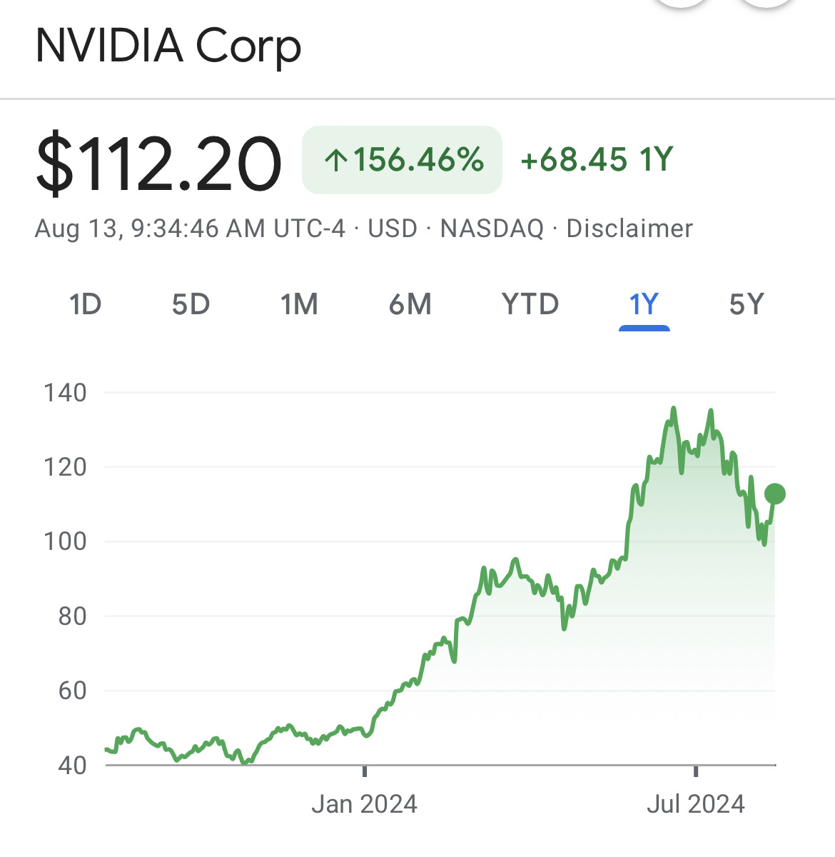
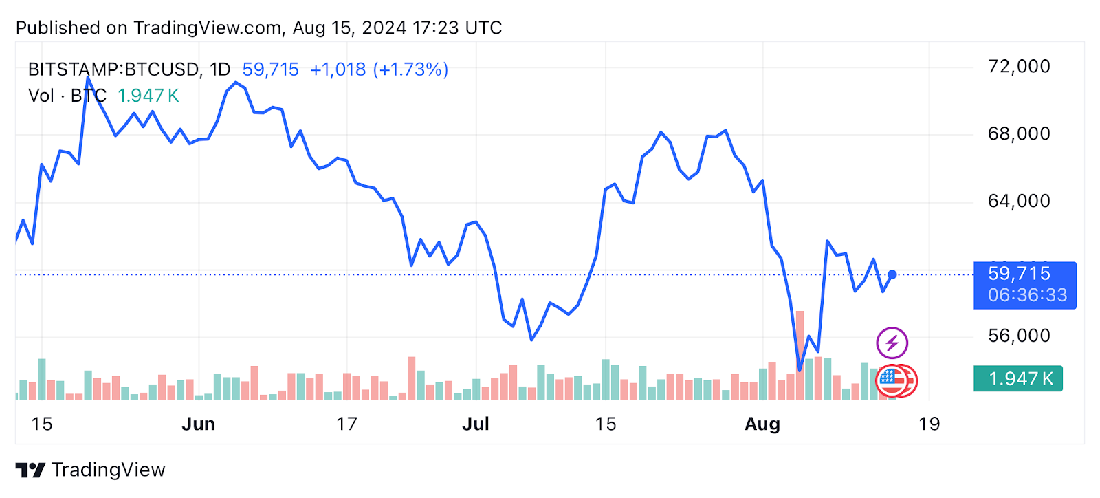
A stock market chart is a visual representation of a stock’s price over time. Traders and investors use these charts to analyze the historical performance of a stock and to predict future price movements.
However, these charts may vary from simple line graphs showing basic price movements to more complex candlestick charts that provide detailed information about price action within specific time frames.
Yet, it is important for you to know how to read stock market charts if you want to make big bucks in the industry. This is because the knowledge will help in understanding market trends, identifying trading opportunities, and making informed investment decisions for a bull or bear market.
According to Statista, the global domestic equity market’s value grew from 65.04 trillion U.S. dollars in 2013 to 111 trillion U.S. dollars in 2023. This shows that with the right knowledge, your success is a high probability.
Furthermore, these charts allow investors to visualize data, making it easier to spot patterns, trends, and anomalies.
For instance, by analysing a stock’s historical price movement, an investor can identify periods of volatility, recognize support and resistance levels, and note market sentiment.
Types of Stock Market Charts
There are different types of stock market charts, offering different levels of detail and insights. As noted by ResearchGate, 90 percent of traders make losses.
Due to this, it is important for traders who want to know how to read stock market charts to know what each represents as this could help prevent losses. The most commonly used charts include:
Line Charts
Line charts are the simplest form of stock market charts. They plot the closing prices of a stock over a specified period, connecting each point with a line.
Furthermore, Line charts are highly versatile in finance and investing as they come in different types to meet your analytical needs. These include simple line charts, multiple line charts, and compound line charts.
Line charts are ideal for beginners learning how to read stock market charts because they provide a clear and straightforward view of a stock’s overall price trend over time. However, it can lack detailed information, such as opening, high, and low prices within each period.
Bar Charts
Bar charts offer more detailed information than line charts. In a bar chart, each bar represents a specific period, like a day, week, or month, and displays the stock’s opening, closing, high, and low prices within that period.
The vertical line of the bar represents the price range (high and low), while the horizontal lines on the left and right, indicate the opening and closing prices, respectively.
The bar chart advantage is that it offers more detailed information, including price range and opening/closing prices.
On the other hand, it can be more complex than line charts, making it overwhelming for beginners.
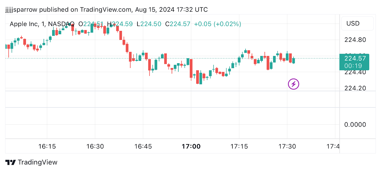
Candlestick Charts
Candlestick charts are very popular among traders because they are a great representation of the fluctuations in the price of a stock.
Traders use candlestick charts to identify trends and predict the potential direction of a stock’s price in the near term. A candlestick visually represents the opening price, closing price, highest price, and lowest price for the time interval it covers.
Each candlestick has three components which are the body, the lower shadow, and the upper shadow. The real body of the candlestick shows the price range between the opening and closing of that trading period.
If the real body is filled or black (often represented as red), it indicates that the close was lower than the open. Likewise, if the real body is white (often green), it signifies that the close was higher than the open.
Overall, it offers several advantages by providing detailed information in a visually intuitive format, making it easier to spot patterns and trends. However, it can be complex and requires some practice to read accurately.
Why Do Most Traders Prefer Candlestick Charts?
Candlestick charting originated in 18th-century Japan, where rice trader Munehisa Homma developed the technique to track price psychology in commodity markets.
It was introduced to Western financial audiences by Steve Nison in the 1990s and has since become the universal standard for technical analysis across stocks, crypto, forex, and commodities.
It was introduced to Western financial audiences by Steve Nison in the 1990s and has since become the universal standard for technical analysis across stocks, crypto, forex, and commodities.
The reason for their dominance is visual clarity.
A screen of colour-coded candles communicates market sentiment instantly whether buyers or sellers controlled a given period in a way that line charts simply cannot match.
Historical studies show that candlestick-driven equity strategies improve win rates by 10 to 15% when paired with volume analysis, compared to basic line chart approaches.
Join UEEx
Experience the World’s Leading Digital Wealth Management Platform
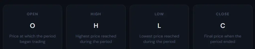
Every candlestick encodes four pieces of price information for the period it represents whether that period is one minute, one hour, one day, or one week.
The rectangular body of the candle spans the distance between the open and close.
The thin lines extending above and below the body are called wicks (or shadows or tails), and they mark the highest and lowest prices reached during the period.
The rectangular body of the candle spans the distance between the open and close.
The thin lines extending above and below the body are called wicks (or shadows or tails), and they mark the highest and lowest prices reached during the period.
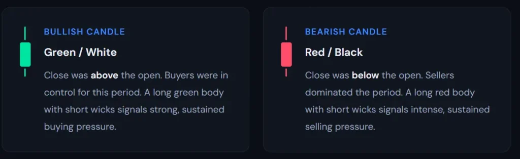
The colour of the body tells you the direction: green (or white) means price closed higher than it opened, indicating bullish control; red (or black) means price closed lower than it opened, indicating bearish control.
The length of the wick tells you about rejection.
A long upper wick on an otherwise bullish candle means price rose significantly during the period but sellers pushed it back down before the close, a sign of supply at higher prices. Key Components of Stock Market Charts
A long lower wick shows buyers stepped in strongly after a drop, rejecting lower prices. These rejection signals are among the most reliable reads a candlestick provides.
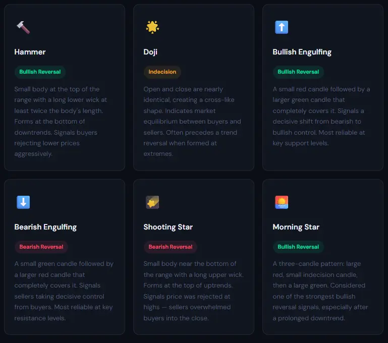
What Are the Most Important Candlestick Patterns to Know?
Individual candles provide context.
Patterns made up of two or more candles in sequence provide signals. The following are the most widely recognised and statistically reliable patterns that active traders use across both stock and crypto markets
Research from multiple studies in 2025 confirms that Morning Star and Evening Star patterns show accuracy rates above 70% when confirmed with a key support or resistance zone.
No pattern works in isolation always seek confirmation from the wider price context and at least one supporting indicator.
Stock Market Indicators
Stock market indicators are statistical tools used by traders to analyze market trends and predict future price movements. There are two main types of indicators:
1.Leading Indicators
Leading indicators provide signals before a new trend or reversal begins. They are useful for traders who want to anticipate price movements. Common leading indicators include:
Relative Strength Index (RSI): One of the key aspects traders focus on is assessing the momentum of a stock’s price.
The Relative Strength Index (RSI) is among the most commonly used momentum indicators. It measures recent price fluctuations to determine whether a stock has been oversold or overbought.
You can select the RSI indicator from the Indicator tab on the left side of your screen. Once selected, an oscillator graph is displayed below the main chart, ranging from 0 to 100.
You should also know that an RSI reading below 30 suggests that a stock is oversold or undervalued, while a reading above 70 indicates that a stock may be overbought or overvalued.
Stochastic Oscillator: A stochastic oscillator is a momentum indicator that compares a security’s closing price to a range of its prices over a specific period.
By adjusting the time period or applying a moving average to the results, you can reduce the oscillator’s sensitivity to market fluctuations.
The stochastic oscillator is commonly used to generate overbought and oversold signals, operating within a range of 0 to 100.
2. Lagging Indicators
Lagging indicators confirm trends after they have started, making them valuable for identifying sustained trends rather than predicting short-term movements. Common lagging indicators include:
Moving Averages: As a trader, predicting trends in the stock market can be challenging. To minimize speculation, it’s essential to utilize chart analysis and the right indicators.
The moving average indicator is one of the most widely used tools for this purpose. It helps traders identify up-trends, down-trends, upward momentum, and downward momentum.
Additionally, it can be used to determine key support and resistance levels. The two most popular types are Simple Moving Average (SMA) and Exponential Moving Average (EMA).
Moving Average Convergence Divergence (MACD): The Moving Average Convergence Divergence (MACD) is a commonly used indicator to assess whether bullish or bearish trends in a stock’s price are gaining or losing strength.
The indicator analyzes the relationship between two moving averages (MAs) of a security’s price. It is calculated by subtracting the 26-period Exponential Moving Average (EMA) from the 12-period EMA.
Also, a nine-day EMA of the MACD line, known as the signal line, is plotted on top of the MACD line. This signal line can serve as a trigger for buy or sell signals, helping traders make informed decisions based on the strength and direction of the trend.
Chart Patterns and Their Significance
Chart patterns are specific formations created by the price movements of a stock that can signal potential future trends. Understanding these patterns is key to technical analysis.
1. Continuation Patterns
A continuation pattern in financial markets signals that the price of a stock or other asset is likely to keep moving in the same direction after the pattern is completed or consolidated. However, not all continuation patterns guarantee the trend will persist.
For instance, the price might reverse direction after forming a triangle or pennant, indicating that the anticipated continuation may not occur.
The types of continuation patterns you’ll come across include:
Triangles: These are formed by converging trend lines, indicating a period of consolidation before the trend continues.
They occur in three different shapes, namely; ascending, descending, and symmetrical.
Flags and Pennants: These are small, short-term patterns that indicate a brief pause before the trend resumes.
2. Reversal Patterns
A reversal pattern indicates a change in the price direction of an asset. It can occur either to the upside or downside, which means after an uptrend, a reversal would signal a downward movement, while after a downtrend, it would suggest an upward movement.
Reversals are identified by observing the overall price direction rather than focusing on just one or two periods/bars on a chart.
Common reversal patterns are:
Head and Shoulders: This type of pattern signals a reversal from a bullish to a bearish trend (or vice versa).
Double Top/Double Bottom: This indicates a reversal when the stock price hits the same high or low twice and then changes direction.
Join UEEx
Experience the World’s Leading Digital Wealth Management Platform
Practical Tips for How to Read Stock Market Charts
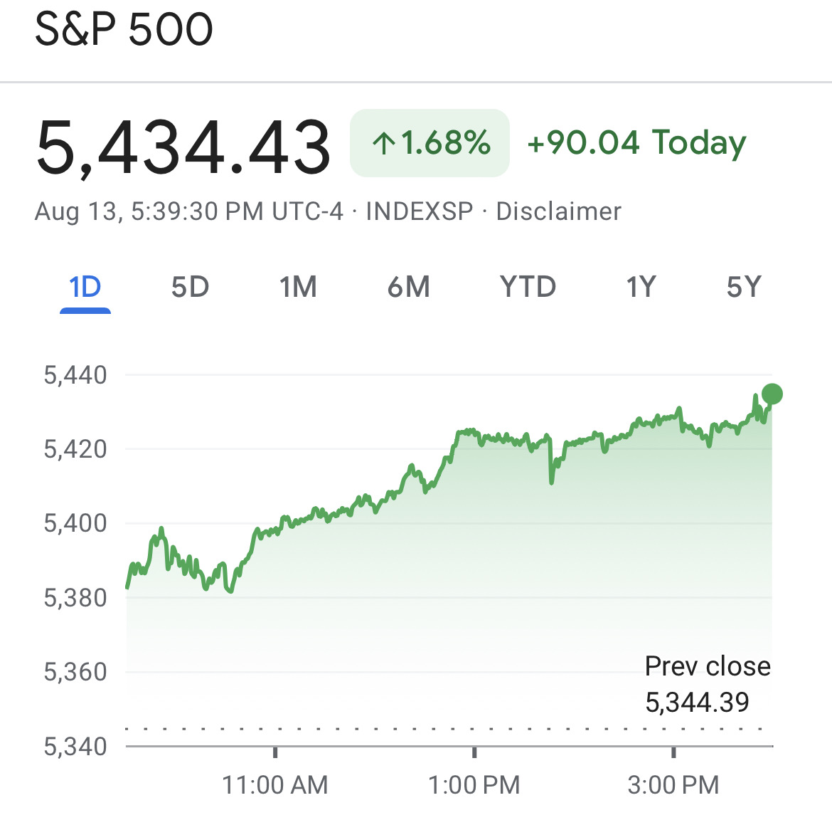
The best way to learn how to read stock market charts is just by looking at it. For beginners, it is also advisable to use a more beginner-friendly chart like a Google stock market chart. When viewing a stock chart, it’s easy to gauge how the stock’s price has performed over a specific period.
The chart typically has the price per share on the y-axis and time on the x-axis, allowing you to quickly observe the stock’s trading history. You can choose different time periods to analyze at the top of the chart.
In the upper left, the current price per share is displayed as $5,434.43. Next to it, you can see how the stock has changed over your selected time period. For instance, S&P 500 stock has increased by $90.04, or nearly 1.68 percent, over the past 24 hours.
A notable feature of Google Finance charts is that the chart line changes color—green or red—based on the stock’s performance during the selected time frame. This gives a simple and clear view of the market activities.
Here are some practical tips to help you read stock market charts like a pro:
1. Start with a Clean Chart
It is advisable to avoid cluttering your chart with too many indicators or annotations.
A clean chart helps you focus on the most important data and makes it easier to identify the trends and patterns you want to work with.
2. Use Multiple Time Frames
To gain a more comprehensive view of a stock’s price movements, it’s important to analyse it using multiple time frames.
For instance, a long-term investor could use weekly and monthly charts to identify the overall trend, and then use daily charts to time entry and exit points.
3. Confirm with Volume
Always verify price movements with trading volume.
A substantial price change accompanied by high volume is more likely to indicate a genuine trend than a movement with low volume.
4. Pay Attention to Support and Resistance Levels
Support and resistance levels are critical in determining potential entry and exit points. Stocks often bounce off these levels, providing trading opportunities.
A price moving above a resistance level is typically seen as a bullish signal, while a price falling below a support level is considered bearish.
However, if a stock repeatedly tests a resistance level without breaking through, it can signal a bearish trend, indicating a potential failure to break out.
Support: A price level where the stock tends to find buying interest, preventing it from falling further.
Resistance: A price level where the stock tends to find selling interest, preventing it from rising further.
5. Practice with Historical Data
Use historical stock data to practice reading charts and identifying patterns. This will help you build confidence and improve your ability to make informed decisions in real-time.
Other Basic Terms of a Stock Market Chart
As mentioned above, stock market charts may vary depending on the source of information. Due to this, we have listed some other terms you may come across in your investment journey.
EPS (Earnings Per Share): This metric indicates how much profit a company has generated per share of its stock.
Ex-Dividend Date: This is the deadline for owning shares to qualify for the upcoming dividend payment. If you purchase the stock after this date, you will not receive the next dividend.
Beta: This value measures a stock’s volatility relative to the overall market. A beta greater than 1 suggests higher volatility, while a beta less than 1 indicates lower volatility. Some investors use beta to gauge risk, though its effectiveness as a risk indicator can vary.
Market Cap (Market Capitalization): This figure represents the total value of a company’s outstanding shares, essentially reflecting the cost to buy the entire company at the current share price.
P/E Ratio (Price-to-Earnings Ratio): This valuation metric compares a stock’s price to its earnings per share, helping investors assess if a stock is fairly valued based on its earnings.
Dividend Yield: This percentage is calculated by dividing the annual dividend per share by the current share price, showing the return on investment from dividends.
Join UEEx
Experience the World’s Leading Digital Wealth Management Platform
Once the charts stop looking like gibberish and those flickering lights on your dashboard start making sense, the market stops being a mystery.
Getting the hang of how to read stock market charts is basically like getting the keys to the kingdom, it turns all that raw data into a story you can actually use.
Abeeb is a goal-oriented content writer with over 4 years of experience in crafting compelling and insightful content across various genres, including tech, news, entertainment, and blockchain. Known for building strong connections with clients and stakeholders, Abeeb is dedicated to delivering clear, concise, and impactful writing that captivates audiences.
Disclaimer: This article is intended solely for informational purposes and should not be considered trading or investment advice. Nothing herein should be construed as financial, legal, or tax advice. Trading or investing in cryptocurrencies carries a considerable risk of financial loss. Always conduct due diligence before making any trading or investment decisions.